adding-custom-fields-checkboxes-field
Checkboxes Field
Articles in this Series
- Introduction
- Parameters for all Custom Fields
- Calendar Field
- Checkboxes Field
- Color Field
- Editor Field
- Integer Field
- List Field
- List of Images Field
- Media Field
- Radio Field
- Repeatable Field
- Sql Field
- Text Field
- Textarea Field
- Url Field
- User Field
- Usergroup Field
- How can you group custom fields
- What components are supporting custom fields
- Implementation into your component
- Use custom fields in your overrides
The Checkbox Field
Provides a single checkbox to be checked or unchecked.
Options
Special options within this field are
- Checkboxes Values
The values of the checkboxes.
Related Information
Screenshots
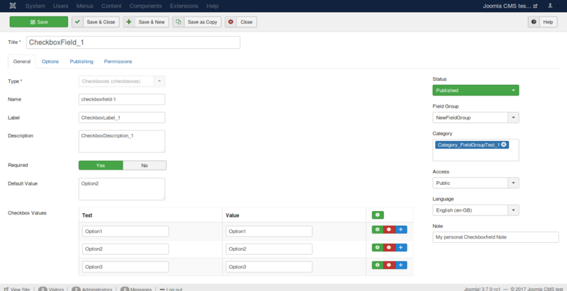
Creating the field
Let's say you create a field with the options shown in the next figure.
Using the field in the backend
In the backend while creating an article or a contact you see the field like in the following imageː

Using the field in the frontend
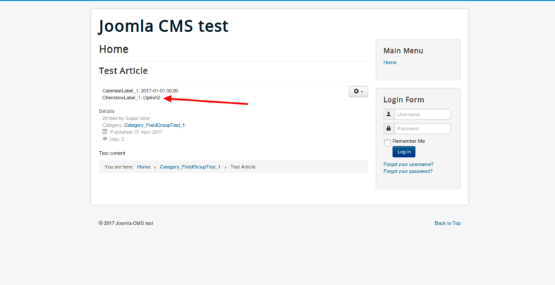
In the frontend, you can see the field as you see in the following image
if it is checked only option 2. The option Automatic display is
responsible for the position of the field and your template is
responsible for the design of the field.
Fields are only displayed in the frontend if you have filled them with
data in the article. If it is not a required field, can you forget it?
 Prev: Calendar FieldNext: Color Field