adding-custom-fields-text-field
Text Field
Articles in this Series
- Introduction
- Parameters for all Custom Fields
- Calendar Field
- Checkboxes Field
- Color Field
- Editor Field
- Integer Field
- List Field
- List of Images Field
- Media Field
- Radio Field
- Repeatable Field
- Sql Field
- Text Field
- Textarea Field
- Url Field
- User Field
- Usergroup Field
- How can you group custom fields
- What components are supporting custom fields
- Implementation into your component
- Use custom fields in your overrides
Text
Provides a text box for data entry.
Options
Special options within this field are:
- Filter
Allow the system to save certain html tags or raw data. Use the raw filter to ensure that html code is preserved when the form is processed. - Maximum Length
The maximum number of characters that can be entered.
Related Information
Screenshots
Creating the field
Let's say you create a field with the options shown in the next figure.

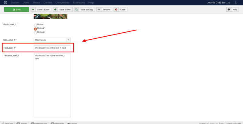
Using the field in the backend
In the backend while creating an article or a contact you see the field like in the following imageː
Using the field in the frontend
In the frontend, you can see the field as you see in the following
image. The option Automatic display is responsible for the position of
the field and your template is responsible for the design of the
field.
Fields are only displayed in the frontend if you have filled them with
data in the article. If it is not a required field, can you forget it?
 Prev: Sql Field Next: Textarea Field